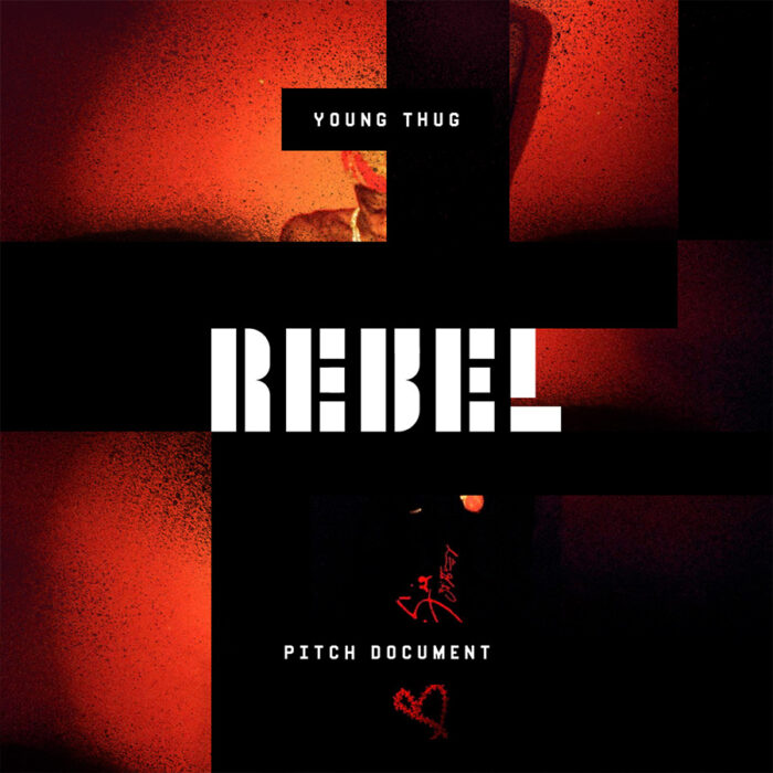
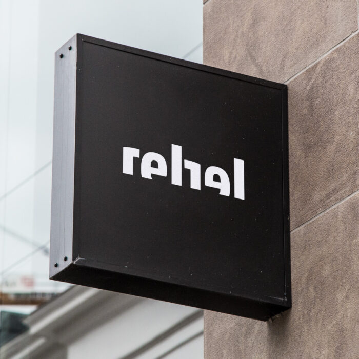
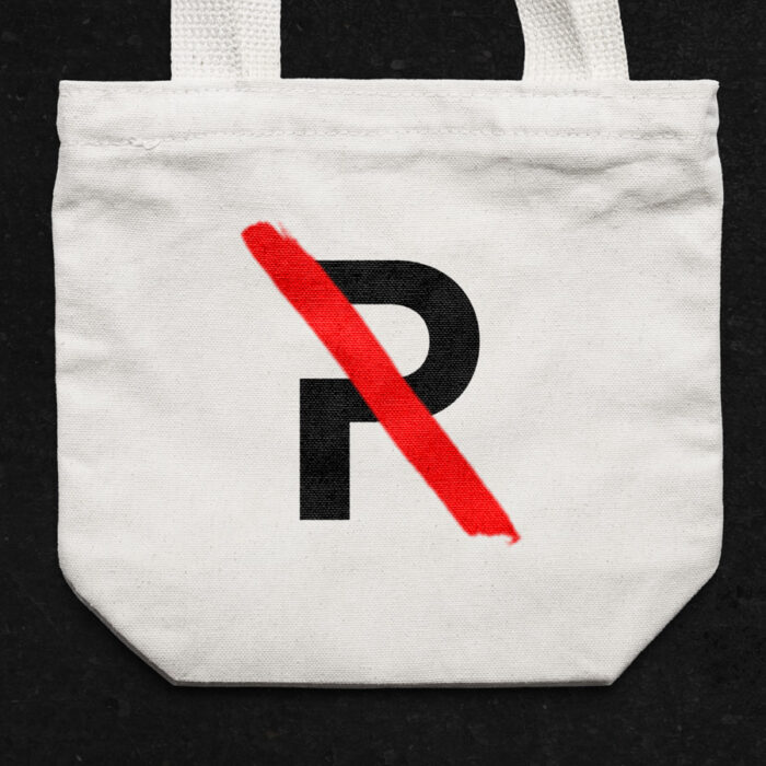
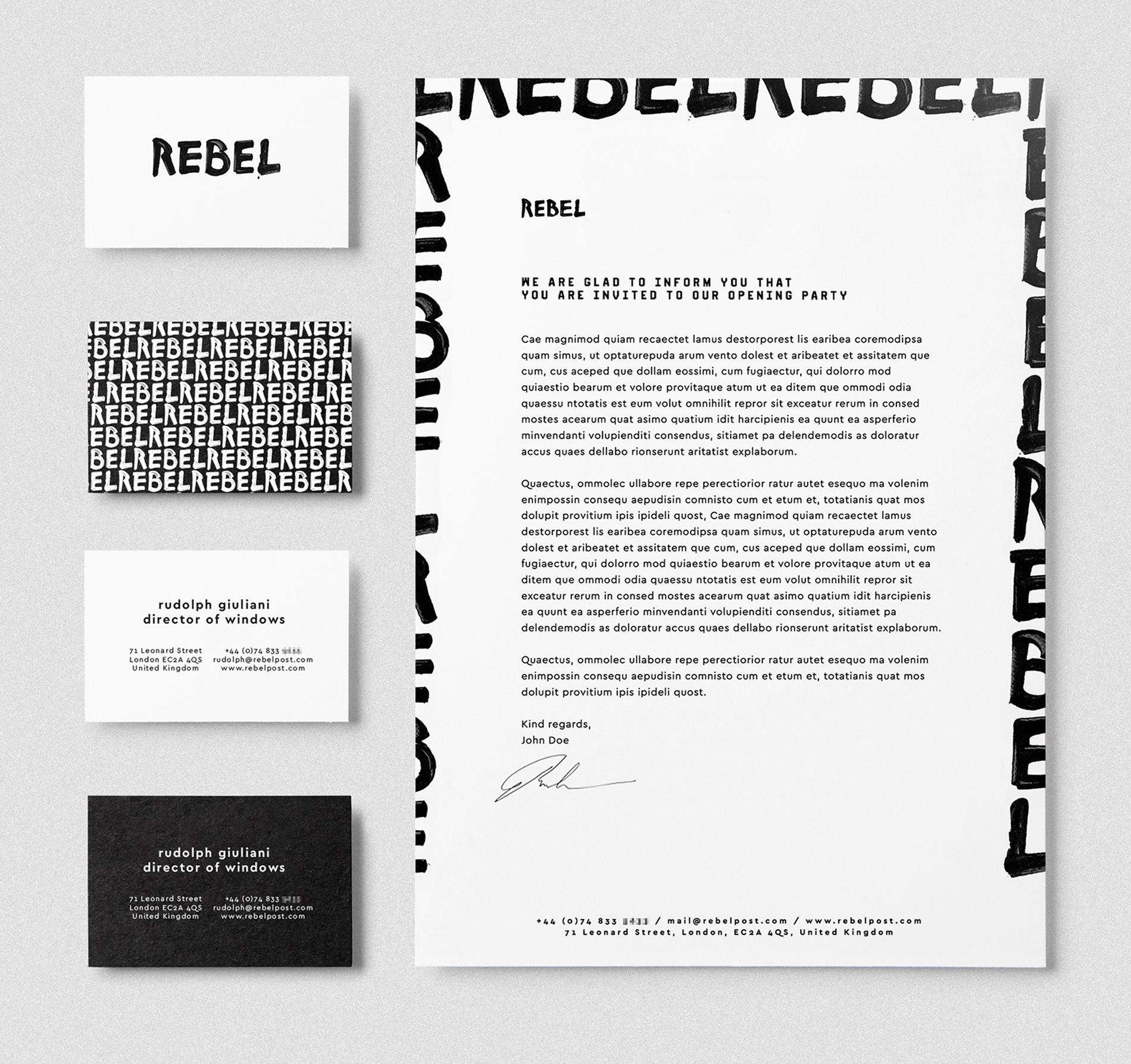
Rebel
The Story
Brand identity for a post-production agency that wants to shake up the market offering a pain-free approach. Rebels, yes, without a clause.
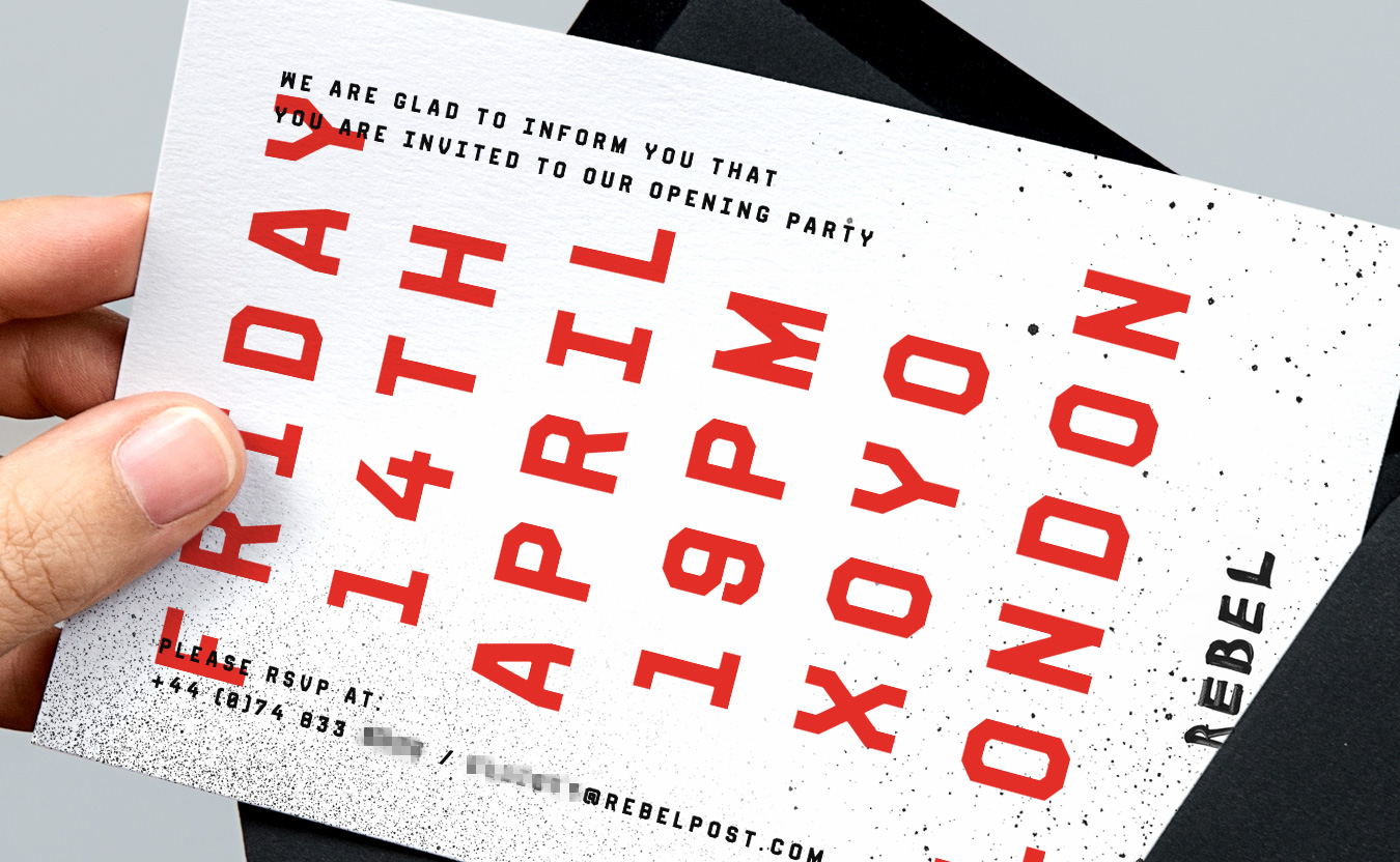
The identity was designed with a personal and direct tone of voice. Rebel’s main priority was to communicate their approach and eclectic body of work in a personal and direct tone of voice. Consistent in the substance but never in the form.
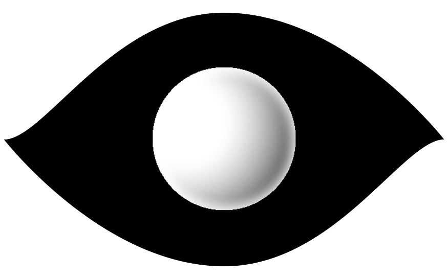
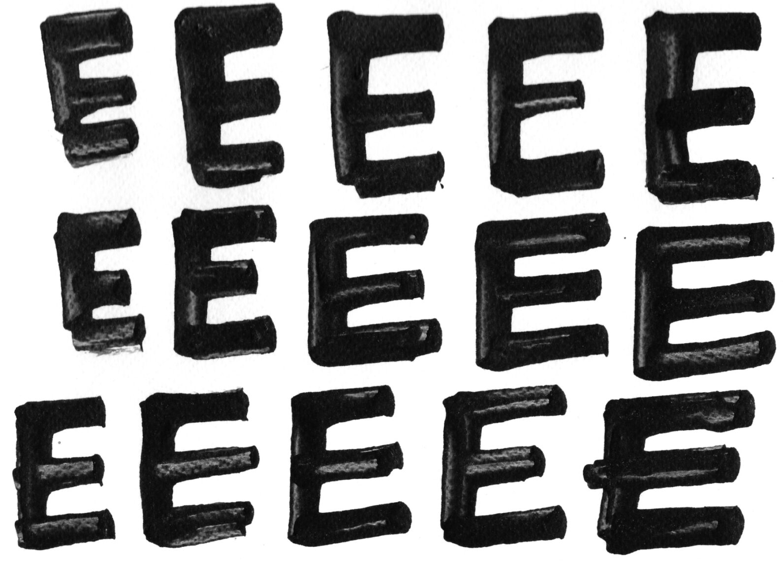
A big design challenge was exploring how varied and nuanced a calligraphic approach can be and how to give appropriate value to each variation of the letters. All of this while still being legible, good looking, and animated.
Client Rebel Post
Role Design & Direction
Studio Freelance
Year 2017
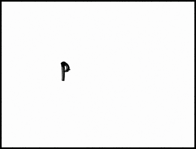
Various routes have been explored during the design process: this one involved using homemade tools to communicate the unconstrained personality of the brand using a folded pen made out of a piece of metal with a curved edge.
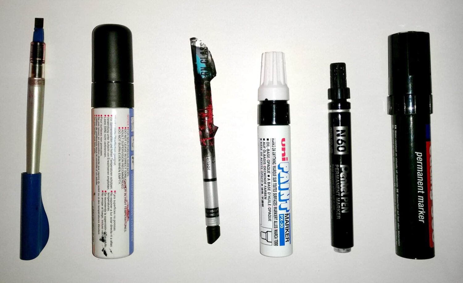
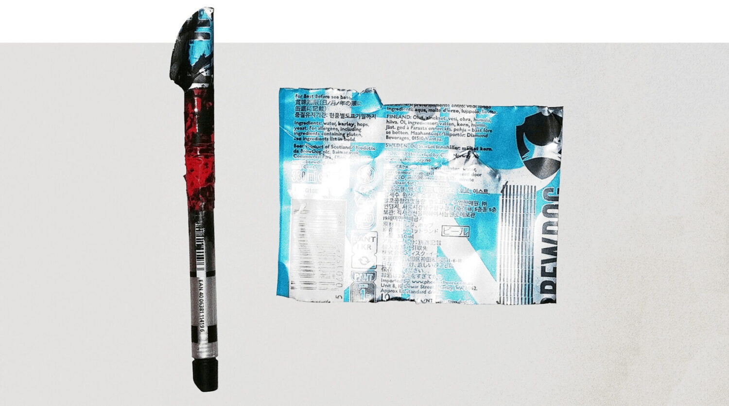
Folded pens are great to give wild, brush-like results.
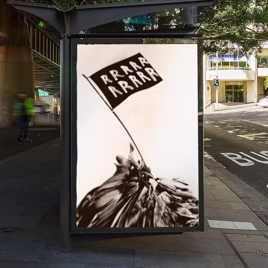
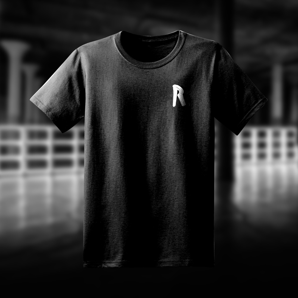
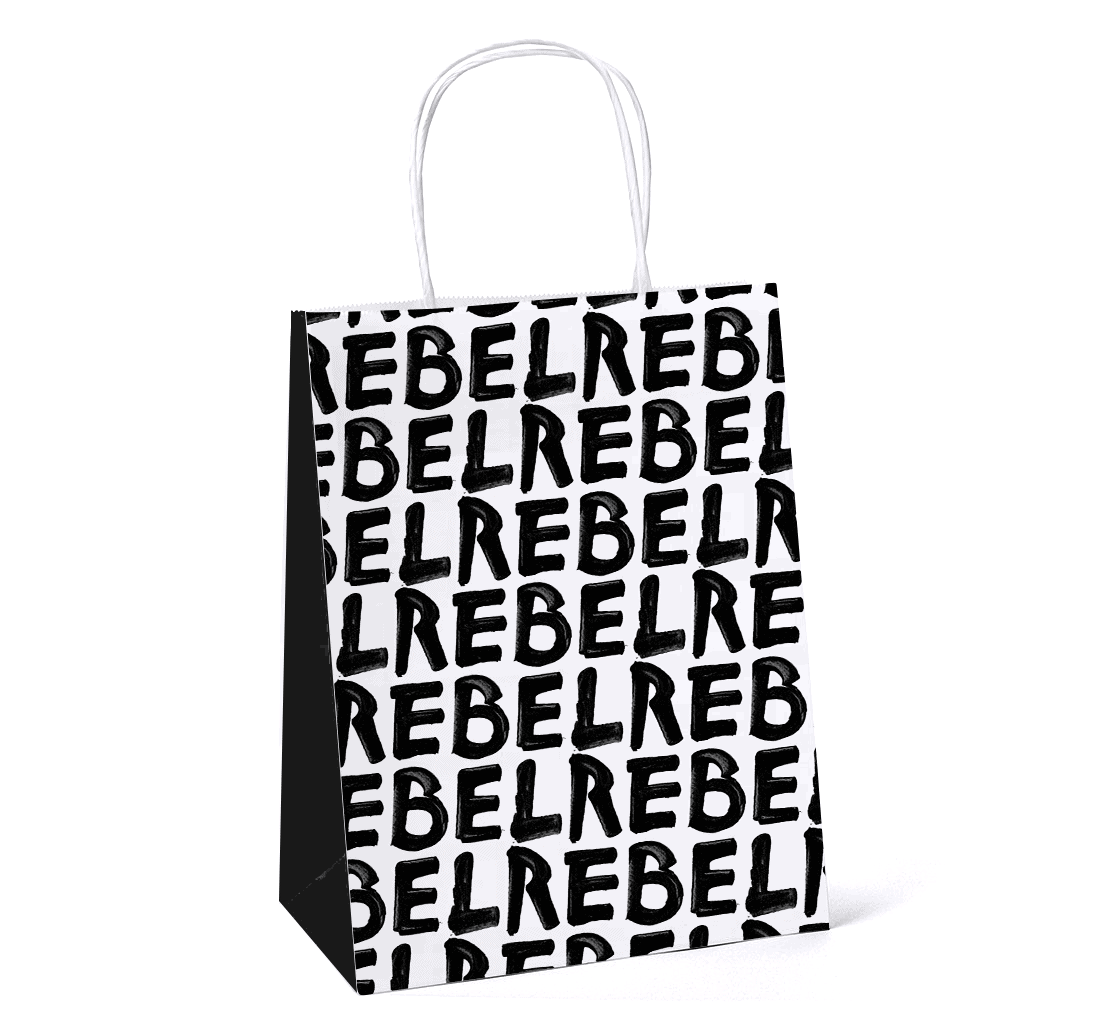
To celebrate their rebellious spirit a series of guerrilla tools have been produced including flags, stencils and stickers.
Various routes have been explored throughout the discovery and design phases, here is a selection of unused ones.
Drag