Devil's Rotisserie
The Story
Serve hot as hell, add iron and irony to taste.
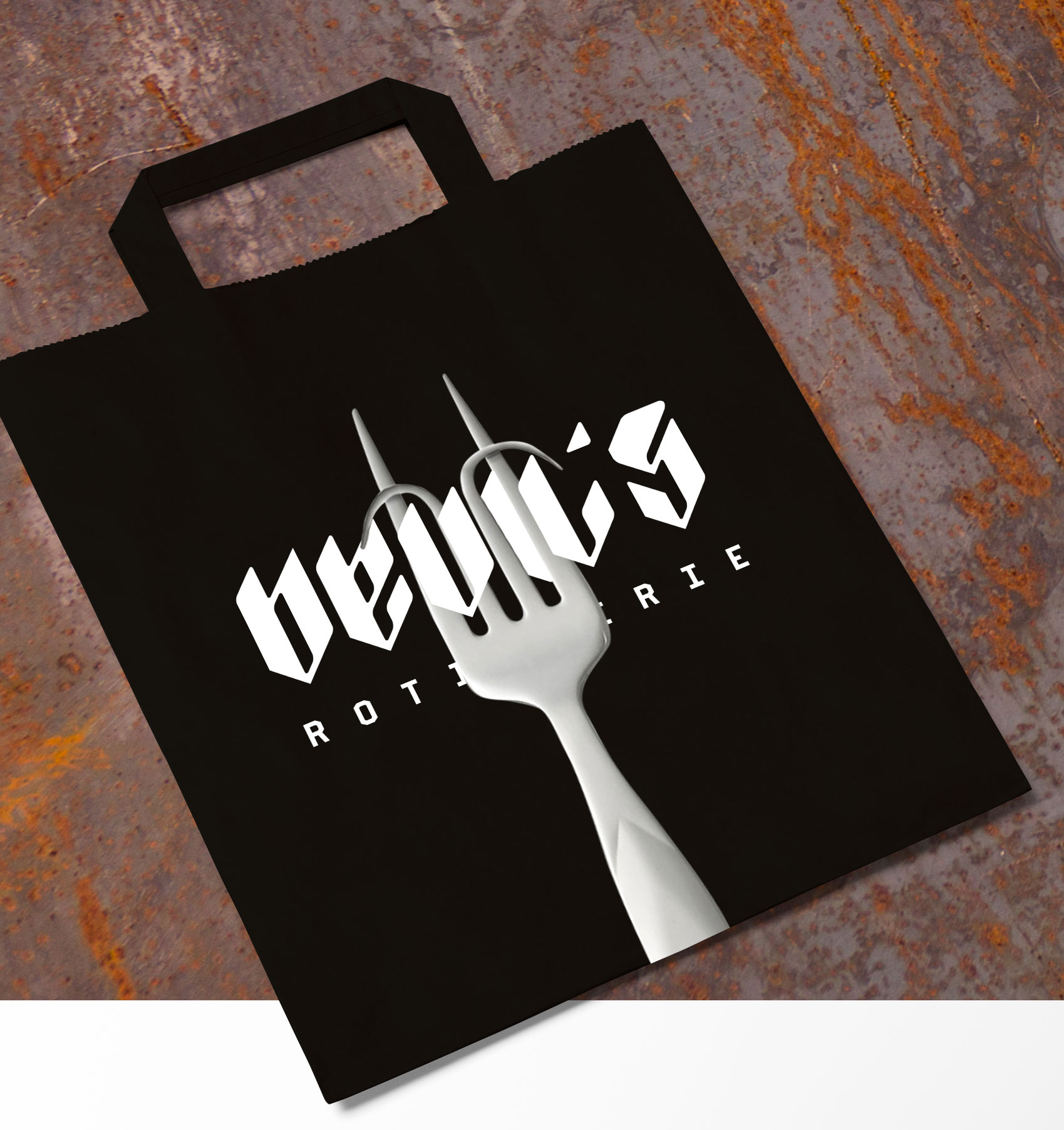
Brand identity, a custom typeface, and marketing material for a hell of a rotisserie where fire reigns uncompromised. Devil’s main priority was to communicate their diabolic attitude to grilling in a friendly and fiendful way.
Client Devil’s Rotisserie
Role Design & Direction
Studio Freelance
Year 2017
The typeface was designed specifically for the wordmark and titling.
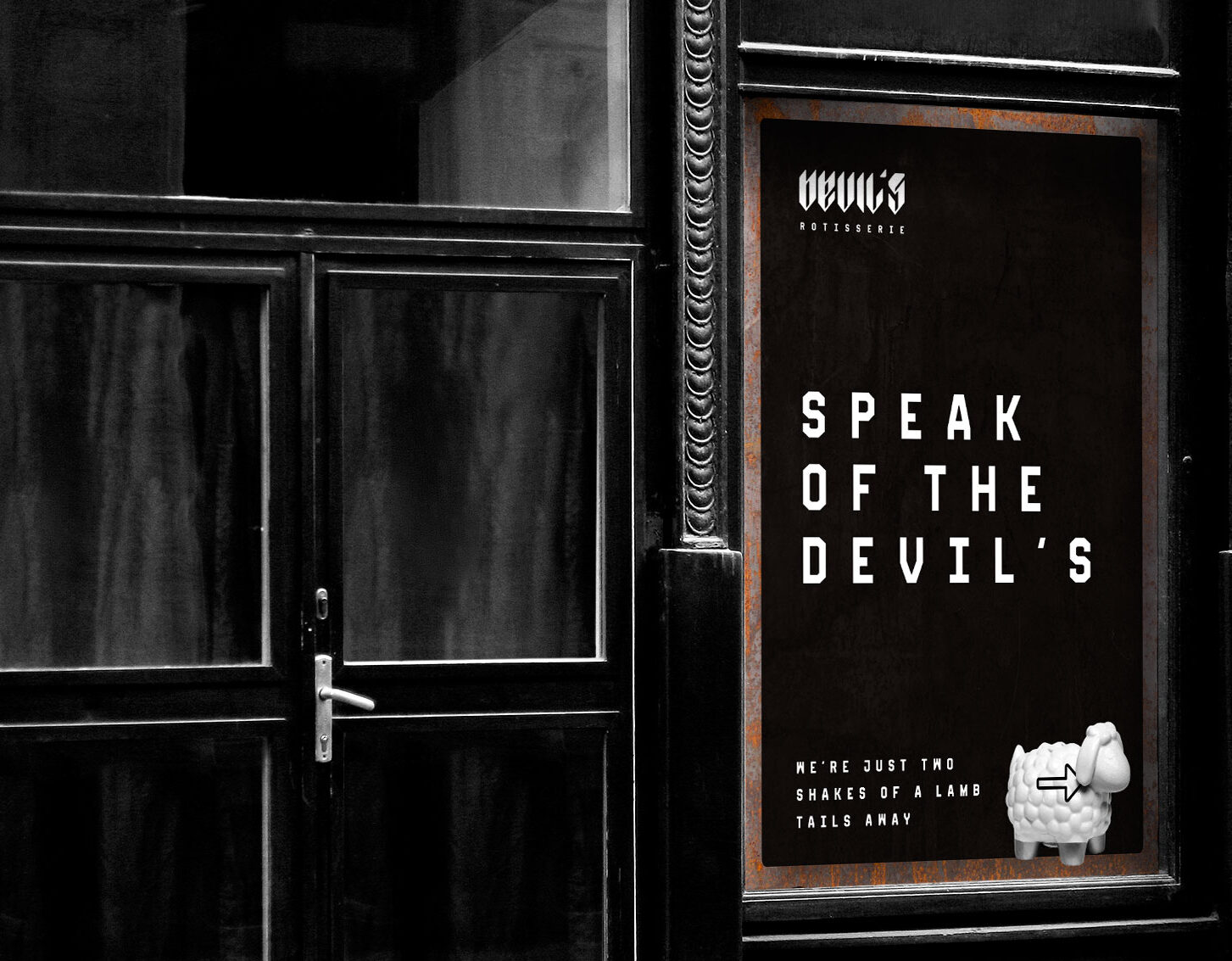
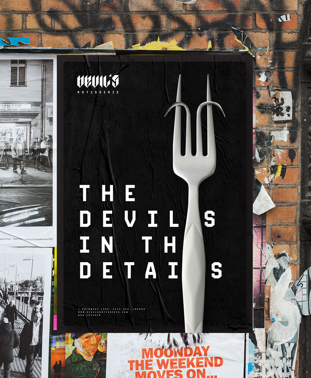
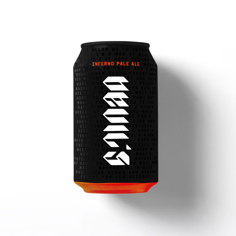
Collateral, beer cans, and the whole brand language are based on variety of idioms about the infernal beast.
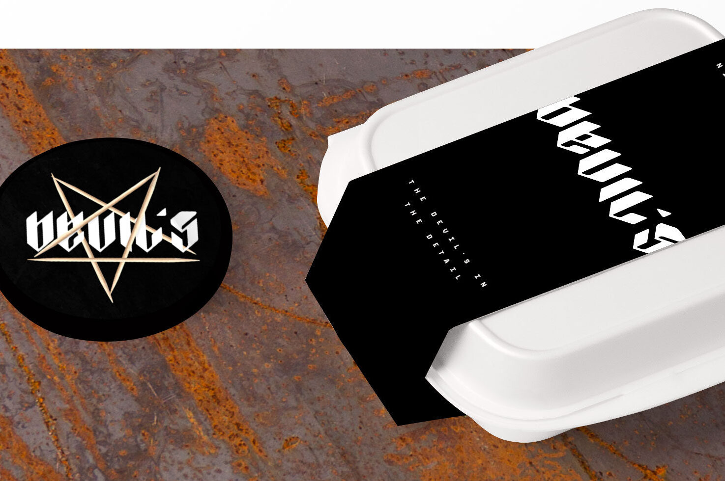
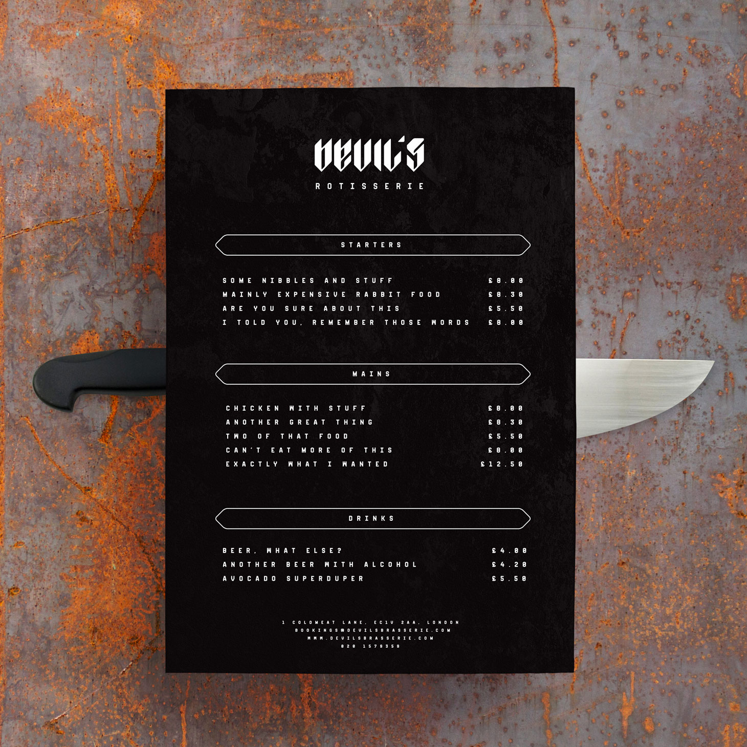
From eat-in to takeaway, all the packaging and marketing material follows a sinful way.